Sat Oct 14, 2006 5:21 am
Rachel wrote:ooh, did we need to show an image showing proof of codability? or only if we think it might be dubious? i dont think there'd be any problems coding my image...
That wont be nessisary.
Just a quick reminder to:
Jade_em
Bangel
Kitten Medli
Neko
Sun Oct 15, 2006 6:47 am
Neko wrote:
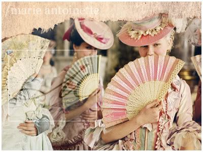
OMG is that BoA?:o
really nice
Sun Oct 15, 2006 6:54 am
Nuuuuez wait for me XD

Programs: Photoshop Elements, Paint
Original Image: http://img215.imageshack.us/img215/3197 ... er2rw5.jpg (its a biggie)
I could have done better probably, but I needed to get one done XP If I have time tomorrow I might do another, because this one is just.. bad.
Programs: Photoshop Elements, Paint
Original Image: http://img215.imageshack.us/img215/3197 ... er2rw5.jpg (its a biggie)
I could have done better probably, but I needed to get one done XP If I have time tomorrow I might do another, because this one is just.. bad.
Sun Oct 15, 2006 10:59 pm
Week 2
LAQ

Original Image: Here
Program Used: GIMP 2.2
Ansile
Original Images: http://i24.photobucket.com/albums/c11/wisseh/10f.jpg
http://i24.photobucket.com/albums/c11/w ... 320725.jpg
Zilary
Images used:Pic 1, Pic 2, Pic 3, Pic 4, Feathers
Program used: Photoshop 7
hakojo
Images: Click, click and click!
Program used: Photoshop Elements
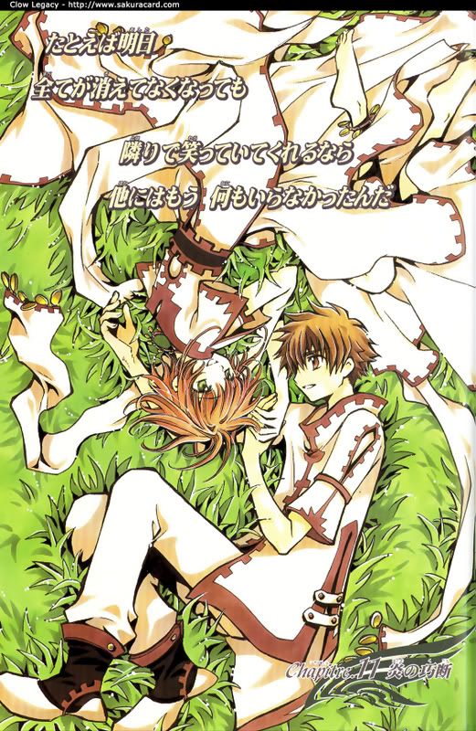
Kugetsu
Program Used: Adobe Photoshop CS
Images Used:
http://img.photobucket.com/albums/v511/ ... untain.jpg
http://img.photobucket.com/albums/v511/ ... tindur.jpg
http://img.photobucket.com/albums/v511/ ... ora-02.jpg
http://img.photobucket.com/albums/v511/ ... e-Wolf.jpg
http://img.photobucket.com/albums/v511/ ... awsize.gif
Ken
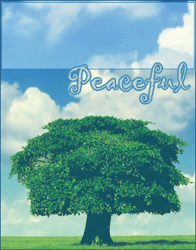
Program : Photoshop CS2
Image Used : Click!
Rachel
Images used: here & here
Program Used: PSP9
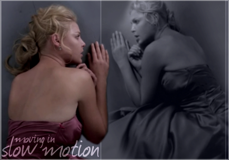
DM was on fire!
Original image: hurr
Programs: PSP 8
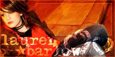
Bangel
Images: One and Two
Program: Paint Shop Pro 9
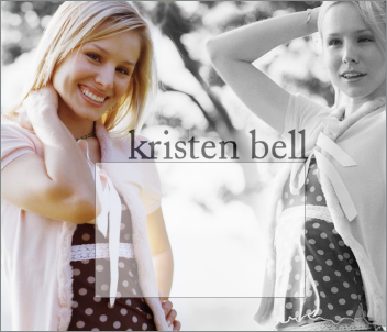
jade_em
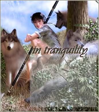
Image: Here
Program: PSP 7
Neko
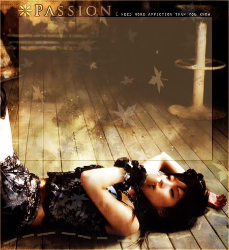
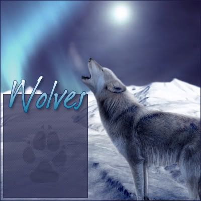
Image Used: Click
Program Used: PS CS2
Kitten Medli
Programs: Photoshop Elements, Paint
Original Image: http://img215.imageshack.us/img215/3197 ... er2rw5.jpg
Grading is due October 19th.
A maximum of 3 people will be eliminated this round.
LAQ
Original Image: Here
Program Used: GIMP 2.2
Ansile
Original Images: http://i24.photobucket.com/albums/c11/wisseh/10f.jpg
http://i24.photobucket.com/albums/c11/w ... 320725.jpg
Zilary
Images used:Pic 1, Pic 2, Pic 3, Pic 4, Feathers
Program used: Photoshop 7
hakojo
Images: Click, click and click!
Program used: Photoshop Elements
Kugetsu
Program Used: Adobe Photoshop CS
Images Used:
http://img.photobucket.com/albums/v511/ ... untain.jpg
http://img.photobucket.com/albums/v511/ ... tindur.jpg
http://img.photobucket.com/albums/v511/ ... ora-02.jpg
http://img.photobucket.com/albums/v511/ ... e-Wolf.jpg
http://img.photobucket.com/albums/v511/ ... awsize.gif
Ken
Program : Photoshop CS2
Image Used : Click!
Rachel
Images used: here & here
Program Used: PSP9
DM was on fire!
Original image: hurr
Programs: PSP 8
Bangel
Images: One and Two
Program: Paint Shop Pro 9
jade_em
Image: Here
Program: PSP 7
Neko
Image Used: Click
Program Used: PS CS2
Kitten Medli
Programs: Photoshop Elements, Paint
Original Image: http://img215.imageshack.us/img215/3197 ... er2rw5.jpg
Grading is due October 19th.
A maximum of 3 people will be eliminated this round.
Last edited by WIS on Mon Oct 16, 2006 12:10 am, edited 2 times in total.
Mon Oct 16, 2006 12:03 am
-cough- My name is spelt Hakojo. I'm the box woman, not the white woman 
Tue Oct 17, 2006 3:35 am
READ THIS before reading comments.
this round is blogs, so i would judge also on rather you have met the critierias for a blog(ie, size, text area etc..), and as well the whole blog graphic wise. alright, keep in mind these are all my opinions, and dont focus too much on the positives, focus on the negatives and how you can improve them.
i will rate and comment the blogs in this kind of structure:
.x. score blog wise - x/10 <--- the design, positioning, structure, size, text area..etc.
.x. score graphic wise - y/10 <--- text & image arrangements, designing, prettiness, colour choice etc.
.x. the good - blah blah blah
.x. the bad - blah blah blah
.x. total score - x+y/20 = average
LAQ
.x. score blog wise - 9/10
.x. score graphic wise - 8/10
.x. the good - really nice colours, fits together over all, good text area, text would be readable, nice image, i like how you put the cat on the top.
.x. the bad - i couldnt really tell the difference between the original image and your graphic(excluding the text area), and it seemed a bit effortless, i just wanted you to put more of your style into it.
.x. total - 17/20 = 8.5/10
Ansile
.x. score blog wise - 7/10
.x. score graphic wise - 8/10
.x. the good - i really love the rip paper on the top, really really nicely designed, and simple as well
.x. the bad - if i put text in that text area, i dont think i would be able to read it, because its so full of stuff and colors, this part was a bit bleh for me.
.x. total - 15/20 = 7.5/10
Zilary
.x. score blog wise - 8/10
.x. score graphic wise - 6.5/10
.x. the good - i like how you arrange the colour balance, so it didnt look like random colours everywhere, really nice text area.
.x. the bad - i dont think the black fits with the flow of the blog, and the red seemed a bit random and plain in the background.
.x. total - 14.5/20 = 7.2/10
hakojo
.x. score blog wise - 9/10
.x. score graphic wise - 9/10
.x. the good - very nice mixture of the 2 images you used, very nice colours and brings out the atmosphere really well, good text arrangements and text area.
.x. the bad - i dont think the boarder of the text area fits the feeling of the graphic, because the the feeling is soft and gentle, but the boarder is bold and solid.
.x. total - 18/20 = 9/10
Kugetsu
.x. score blog wise - 8/10
.x. score graphic wise - 7/10
.x. the good - really nice blend of all those images, its very natural and the colours are pleasing to the eye to look at.
.x. the bad - im afraid im not liking the text in this one, i dont think the font fits with graphic, and it stood out a bit much for me.
.x. total - 15/20 = 7.5/10
Ken
.x. score blog wise - 9.5/10
.x. score graphic wise - 8/10
.x. the good - very simple but pretty set, and it really brings out a peaceful feeling, well done.
.x. the bad - hm...cant really find any.
.x. total - 17.5/20 = 8.8/10
Rachel
.x. score blog wise - 6/10
.x. score graphic wise - 8/10
.x. the good - i love how you arranged the images and the text, how she is facing her self and the colours are good.
.x. the bad - i dont know where the text area is...im assuming its on the semi black and white part of the right, but i doubt that text would show on there, so.. im gonna have to take marks off for that. sorry.
.x. total - 14/20 = 7/10
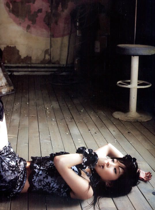
DM was on fire!
.x. score blog wise - 7/10
.x. score graphic wise - 7/10
.x. the good - nice placement of the person lying and the text area behind the person, i really like it.
.x. the bad - cant really tell the difference between the original image and the blog, it kinda looked like you just put it there without any designing, it still looks very nice over all though, i just wanted to see more of your style.
.x. total - 14/20 = 7/10
Bangel
.x. score blog wise - 9.5/10
.x. score graphic wise - 8.5/10
.x. the good - very nice arrangement of the images and the structure of your blog, nice text area too, colour choices are great, how its mainly black and white, and the focus of the blog is coloured which is good.
.x. the bad - it didnt look like you did any decorating to the original images, i want to see more of your style, but if this IS your simplistic style, i like it!
.x. total - 18/20 = 9/10
jade_em
.x. score blog wise - 6.5/10
.x. score graphic wise - 6.5/10
.x. the good - nice designing of where the text area is and the focus is clearly divided.
.x. the bad - the text area would be hard to read... and the graphic seem a bit messy and plain.
.x. total - 13/20 = 6.5/10
Neko
.x. score blog wise - 9/10
.x. score graphic wise - 10/10
.x. the good - very, very nice colour coice+designing/arrangment/text placement, very well done! =)
.x. the bad - none.
.x. total - 18.5/20 = 9.5/10
Kitten Medli
.x. score blog wise - 10/10
.x. score graphic wise - 9/10
.x. the good - probaly the best, interms of blog wise, very nice text area, the focus is clearly where the text should be, and fox is on the side, not too "in your face" but still clearly seen and pretty to look at, very nice designing and structure.
.x. the bad - hm, none
.x. total - 19/20 = 9.5
Wed Oct 18, 2006 1:48 am
OMG is that BoA?:o
really nice
Yup, that's BoA!
Wed Oct 18, 2006 10:02 am
blueZ wrote:.x. the bad - i dont know where the text area is...im assuming its on the semi black and white part of the right, but i doubt that text would show on there, so.. im gonna have to take marks off for that. sorry.
the whole of the black and white bit on the right is the text area (because personally i dont like small text areas on blogs - but thats a personal preference). I thought that the text would show easily would be obvious so i didnt post a picture of it, but this is what it would look like http://img.photobucket.com/albums/v390/ ... ogtext.png
Wed Oct 18, 2006 5:27 pm
Thanks blueZ. 
I did try and do a lot to it, but it was hard since the picture was dark. I should've had a layer on screen, and then one on hard light.
I did try and do a lot to it, but it was hard since the picture was dark. I should've had a layer on screen, and then one on hard light.
Thu Oct 19, 2006 4:47 am
Week 2
LAQ
The colors are pretty, and I like how you've warmed it up. The colors go well together. The blog area is nice as well, but the biggest problem for me in this blog is the quality of the image. The JPEGyness of the graphic really disrupts the nice, peaceful feeling of the blog. I dont know what noise removers are in GIMP, but if you can, try to enhance the quality of the images, when using low quality images like this. - 8/10
Ansile
The ripped paper effect is nice. But I think the blog background isn't... opaque enough. I think text would have trouble showing up on there. Also, I can still notice the slight JPEG quality to the image. Try one of Photoshop's noise removers, I quite like Smart Blur too. - 8/10
Zilary
This is certainly very creative. It looks like you've put a lot of effort into it, especially in extracting those feathers out. I like the old, nostalgia effect the photos have, but I have to complain about a few things. The red background seems kind of weird. I think it would also work if you chose a slightly lighter beige color instead of the black. However, the text is probably the biggest downfall. It looks very... weird and it doesn't seem to fit the blog at all. I think if you were to use a simple, windows default font. Something like that, on a slightly darker color than the background, would have worked much better. - 7.5/10
hakojo
Wow. I just think this is gorgeous! I love how you manipulated the images, and the mystical feel of the whole thing. The text works well, and the faded book and the small text in the background of the blog is good also. It's barely noticable, which is good. The blog is also very functional. Excellent job! - 9.5/10
Kugetsu
Well, I think it's nice how you blended all those images together. It must've taken a long time. I'd like to say, I'm sooooo very glad that you edited your blog, to put new text on. However, the new one still doesn't really fit in with the blog, but it's getting better. The pawprint in the background is nice, and adds to the blog. - 8/10
Ken
I like this one. It has a very simple, soothing feel to it. It's also very clean looking, which is a plus. The font seems more Playful than peaceful to me, but it's still good. - 8.5/10
Rachel
The blog on a whole is pretty good. The girl faded into the text area though, I think, could be just a little more faded. Not that text wont show there, but the fact that it can also distract your attention from the text that is going to be on there. I dont quite like the font as well, it doesn't seem to fit the mood of this blog. Again, perhaps a windows default font, like Georgia or Garamond might work better. I know you're going for a "dim" feel, but it really seems dull. - 7.5/10
DM was on fire!
One of my biggest problems with this is the text area. Now, I'm all for the "a part of the person is in the text area" effect, it looks quite good sometimes. I think you might have overdone it a bit, because a good chunk of the text will be on her knee and her shoulder, which does look very weird. I dont quite like the pixalized effect on her also. - 7.5/10
Bangel
I really like this one, because it is very clean and relaxing. I think the greyscale and blending worked great here. Love the text also. I can notice just a tiny bit of blending problems around her hair, but it still looks very good. I think that you can move the text box over to the right just a bit more though, so that it covers a little bit less of the colored girl, which I assume is the main focus. - 8.5/10
jade_em
The whole feel of the graphic comes off as a little bit messy. I know that Paint shop pro has some noise removers, so you may want to run the image through a JPEG artifact remover before you start working with it. The text area seems very bland, also. - 7/10
Neko
Ahh, this is very pretty. It also functions as a great blog. I like the colors of the blog too. The text looks great. The only problem I have, and it's just a very small problem. I think the flower beside "Passion" looks kinda out of place. Perhaps you can replace it with one of the maple leaves you used in the blog? - 9/10
Kitten Medli
The colors work together very well on this one, the background is nice too. The blog area is very nice, and it looks very good. But I was just wondering why you didn't move it over to the left a bit more. There's space there, and you can move it so that there wont be a scrollbar over the fox's sceptre. Other than that though, it's a great blog. - 8.5/10
LAQ
The colors are pretty, and I like how you've warmed it up. The colors go well together. The blog area is nice as well, but the biggest problem for me in this blog is the quality of the image. The JPEGyness of the graphic really disrupts the nice, peaceful feeling of the blog. I dont know what noise removers are in GIMP, but if you can, try to enhance the quality of the images, when using low quality images like this.
Ansile
The ripped paper effect is nice. But I think the blog background isn't... opaque enough. I think text would have trouble showing up on there. Also, I can still notice the slight JPEG quality to the image. Try one of Photoshop's noise removers, I quite like Smart Blur too. - 8/10
Zilary
This is certainly very creative. It looks like you've put a lot of effort into it, especially in extracting those feathers out.
hakojo
Wow. I just think this is gorgeous! I love how you manipulated the images, and the mystical feel of the whole thing. The text works well, and the faded book and the small text in the background of the blog is good also. It's barely noticable, which is good. The blog is also very functional. Excellent job!
Kugetsu
Well, I think it's nice how you blended all those images together.
Ken
I like this one. It has a very simple, soothing feel to it. It's also very clean looking, which is a plus.
Rachel
The blog on a whole is pretty good. The girl faded into the text area though, I think, could be just a little more faded. Not that text wont show there, but the fact that it can also distract your attention from the text that is going to be on there. I dont quite like the font as well, it doesn't seem to fit the mood of this blog. Again, perhaps a windows default font, like Georgia or Garamond might work better. I know you're going for a "dim" feel, but it really seems dull. - 7.5/10
DM was on fire!
One of my biggest problems with this is the text area. Now, I'm all for the "a part of the person is in the text area" effect, it looks quite good sometimes. I think you might have overdone it a bit, because a good chunk of the text will be on her knee and her shoulder, which does look very weird. I dont quite like the pixalized effect on her also. - 7.5/10
Bangel
I really like this one, because it is very clean and relaxing. I think the greyscale and blending worked great here. Love the text also. I can notice just a tiny bit of blending problems around her hair, but it still looks very good. I think that you can move the text box over to the right just a bit more though, so that it covers a little bit less of the colored girl, which I assume is the main focus. - 8.5/10
jade_em
The whole feel of the graphic comes off as a little bit messy. I know that Paint shop pro has some noise removers, so you may want to run the image through a JPEG artifact remover before you start working with it. The text area seems very bland, also. - 7/10
Neko
Ahh, this is very pretty. It also functions as a great blog.
Kitten Medli
The colors work together very well on this one, the background is nice too. The blog area is very nice, and it looks very good. But I was just wondering why you didn't move it over to the left a bit more. There's space there, and you can move it so that there wont be a scrollbar over the fox's sceptre. Other than that though, it's a great blog.
Fri Oct 20, 2006 2:39 am
I'll give the other two judges one more day (Oct. 20th) to get their ratings done. =\ If not, I'm going to start the next round without them.
Sat Oct 21, 2006 10:09 am