Sun Oct 29, 2006 10:28 pm
I am gonna judge with a slight different system this week.
because it is week 3, i am going to be really tough on you guys, because the standard is very very high, so please understand
Hakojo
.x Score - 7/10
.x Comment - Very, very, very creative, i LOVE your originality. but the 2 lines crossing did not work for me, and the rainbow seemed a bit out of place, and the atmosphere of the graphic is a bit too plain, which does not fit artistically with the butterfly which reflects your creativity.
Ken
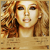
.x Score - 7/10
.x Comment - the text with the bars are a nice touch, but it seems vague and unreadable, which is not negative. but the way you treated jessica alba is that you made her really colourful, bold, and full of stuff, but the text bar how ever, was the opposite, so i didnt think it fit well for me.
Bangel
.x Score - 9/10
.x Comment - Very nice arrangement of focus and text, the colours are very pleasing to look at, focus is divided nicely, and the colours reflects an old-newspaper feeling, which is nice.
Ansile
.x Score - 7.5/10
.x Comment - The colour choice was good, but its a bit too plain, i dont really see your creativity and originality, and the 2 funky lines didnt work for me.
Neko
.x Score - 9.5/10
.x Comment - Very nice text arrangement, colour choice, and very very well designed, very good job.
Zilary
.x Score - 6.9/10
.x Comment - It seems like its a bit too stuff'd, things are everywhere, and the focus isnt really clear, but i like the colours you chose, blends well together.
Kugetsu
.x Score - 6/10
.x Comment - Its a bit plain, it seemed like you just took the image and put text on it...i really hoped to see your style and creativity.
LAQ
.x Score - 9/10
.x Comment - Your avatar really brings out the feeling and mood of the graphic, very nice. Good colour choice, text arrangement and designing. Well done.
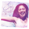
Kitten Medli

.x Score - 8.9/10
.x Comment - Very nice background, fits very very well, i really love your text. Its very original. well done.
Tue Oct 31, 2006 12:47 am
Week 3
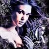
Hakojo
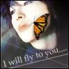
I think your icon has a very sophisticated feel to it. And I'm glad you put some color into the person's face, because I know it's easy to over-contrast an image such as this. However, the problem with editing a butterfly onto someone's face is that although you did an excellent job, it still doesn't look too natural. The image you used was also of fairly bad quality, so it would've been nice if you had fixed it up. - 8/10
Ken
The one big big big problem I have with scanlines is, not that I hate them. They do look good, but it looks really awkward when your scanlines are dark, and they go over a white area, and you can notice it much more in that area. (Or vice versa if you have white scanlines and they go over a dark area). What I always tell people is when they're doing scanlines, is to erase the scanlines on the face using a soft brush. It takes about two seconds, and I think it looks much better. Also, the effect you did with the text is neat, but I think it would have worked much better if the background and the border were white. - 7.5/10
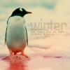
Bangel
I like this icon, because it's very pleasing to look at. The text is definatly a plus, but however, I really, really liked the icon you posted before you changed it. (The transparent one) I dont like the text on this avatar as much, because although penguins are playful, and Comic Sans is a playful looking font, the whole color scheme seems very washed out. However, you still did a good job. I hope you didn't delete the icon you did before though, I would like to see it again. - 8.5/10
Ansile
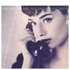
Pretty. I like how you colored Audrey Hepburn, the colors are very nice and pleasing to the eye. Simplicity isn't always a bad thing, and sometimes it takes more skill to know when to stop. However, I'm not that fond of the white lines that you have put as a space filler on the left, I would rather you have some faint, simple text. - 8.5/10
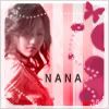
Neko
The colors and the shapes on the right pull the icon together nicely. I dont have many big concerns about this icon, except for the fact that the white border seems to be a little messy at times, and un-anti aliased; and that N A N A text, in my opinion, would look better set as overlay or some sort of blend mode. Other than that, good job! - 9/10
Zilary
While I applaud the effort you put into your graphics, I do think you over-did this one a bit. The icon seems a little bit messy and confusing. However, I do like the way you colored the icon, and the text would be good as well if it didn't have a stroke, and was anti-aliased. I think it would have actually looked pretty good if it was just white. - 7.5/10
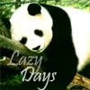
Kugetsu
I really do like how you fixed that image up, it looks much nicer and it's good that you have gotten rid of the noise. However, once again, text seems to be your downfall.  The font type is okay, but the font seems rader subdued and faded. I think in an icon such as this, dont be afraid to do bold black and white to go with the panda motif. Perhaps the word "lazy" could be in bold, black with a white dropshadow, and vice-versa for the word "days". - 7.5/10
LAQ
Pretty! The image seems very soft, and the colors work excellently together. The white border is very creative, and it looks quite good. The text is excellent as well! The only thing I might add is that I wish your image was a little bit sharper, as the girl looks a little blurry right now. Other than that, good job! - 9/10
Kitten Medli
Aww, this icon is quite cute! The colors and the greens are nice, and the cutout was done nicely. The text works well with this fun icon. However, I think that you could have blurred the edges, where the hands are (and a little bit of the frog) so that it looks a bit more realisic, and a bit more like how it was in the photograph. Perhaps the border could be a little thicker as well, other than that though, nice job. - 8.5/10
Hakojo
I think your icon has a very sophisticated feel to it.
Ken
The one big big big problem I have with scanlines is, not that I hate them. They do look good, but it looks really awkward when your scanlines are dark, and they go over a white area, and you can notice it much more in that area. (Or vice versa if you have white scanlines and they go over a dark area). What I always tell people is when they're doing scanlines, is to erase the scanlines on the face using a soft brush. It takes about two seconds, and I think it looks much better. Also, the effect you did with the text is neat, but I think it would have worked much better if the background and the border were white. - 7.5/10
Bangel
I like this icon, because it's very pleasing to look at. The text is definatly a plus, but however, I really, really liked the icon you posted before you changed it. (The transparent one) I dont like the text on this avatar as much, because although penguins are playful, and Comic Sans is a playful looking font, the whole color scheme seems very washed out. However, you still did a good job.
Ansile
Pretty. I like how you colored Audrey Hepburn, the colors are very nice and pleasing to the eye. Simplicity isn't always a bad thing, and sometimes it takes more skill to know when to stop. However, I'm not that fond of the white lines that you have put as a space filler on the left, I would rather you have some faint, simple text. - 8.5/10
Neko
The colors and the shapes on the right pull the icon together nicely.
Zilary
While I applaud the effort you put into your graphics, I do think you over-did this one a bit. The icon seems a little bit messy and confusing. However, I do like the way you colored the icon, and the text would be good as well if it didn't have a stroke, and was anti-aliased. I think it would have actually looked pretty good if it was just white. - 7.5/10
Kugetsu
I really do like how you fixed that image up, it looks much nicer and it's good that you have gotten rid of the noise.
LAQ
Pretty! The image seems very soft, and the colors work excellently together. The white border is very creative, and it looks quite good. The text is excellent as well! The only thing I might add is that I wish your image was a little bit sharper, as the girl looks a little blurry right now. Other than that, good job! - 9/10
Kitten Medli
Aww, this icon is quite cute! The colors and the greens are nice, and the cutout was done nicely. The text works well with this fun icon.
Tue Oct 31, 2006 2:36 am
Yeah, I spent like 45 minutes just trying to figure out what font to use, how to place it, and how to make it look. I seem to lack any sort of direction with the fonts. Finally, after keeping my friend waiting for like an hour, I just sent it, though, of course, I'm never happy with the fonts, myself. >_<
Tue Oct 31, 2006 2:40 am
Kugetsu wrote:Yeah, I spent like 45 minutes just trying to figure out what font to use, how to place it, and how to make it look. I seem to lack any sort of direction with the fonts. Finally, after keeping my friend waiting for like an hour, I just sent it, though, of course, I'm never happy with the fonts, myself. >_<
You know what they say.
Tue Oct 31, 2006 6:47 am
I had/have musical (Beauty and the Beast) practice all week/end long. I won't be able to judge this week either, sorry WIS!!! I swear I'll judge next week!
Tue Oct 31, 2006 7:31 am
The results: http://pptga.awardspace.com/
Unfortunatly, Zilary and Kugetsu are eliminated.
--
Week 4 Assignments:
S: Album Cover
- Create an Album Cover for a band
- The size must be between 400x400 and 500x500
- The shape must be a perfect square
- You must use more than 3 images, I dont care how you use them
- The Album Cover must contain the Artist/Band name, and the Album Name
- There cannot be a significant amount of the color red in the graphic, if you are unsure, just ask
A: N/A
B: N/A
C: N/A
Maximum of 2 people may be eliminated this round.
All graphics are due by November 4th.
---
Graphic Notes:
- An example of some Album Covers are:


- Album covers do not necessarilly need borders.
- Get creative with this one.
Unfortunatly, Zilary and Kugetsu are eliminated.
--
Week 4 Assignments:
S: Album Cover
- Create an Album Cover for a band
- The size must be between 400x400 and 500x500
- The shape must be a perfect square
- You must use more than 3 images, I dont care how you use them
- The Album Cover must contain the Artist/Band name, and the Album Name
- There cannot be a significant amount of the color red in the graphic, if you are unsure, just ask
A: N/A
B: N/A
C: N/A
Maximum of 2 people may be eliminated this round.
All graphics are due by November 4th.
---
Graphic Notes:
- An example of some Album Covers are:
- Album covers do not necessarilly need borders.
- Get creative with this one.
Tue Oct 31, 2006 8:58 pm
Does it have to be for an existing band?
Tue Oct 31, 2006 11:37 pm
hakojo wrote:Does it have to be for an existing band?
It should be.
Wed Nov 01, 2006 9:25 pm
Does it have to be for an existing album? Or do we make up the album?
Thu Nov 02, 2006 1:36 am
Bangel wrote:Does it have to be for an existing album? Or do we make up the album?
Either.
Fri Nov 03, 2006 8:21 pm
Sat Nov 04, 2006 2:16 am
Sat Nov 04, 2006 2:29 am
http://www.peterschrock.com/images/blog ... nequin.jpg
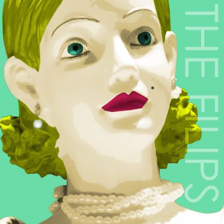
If you couldn't tell, my inspiration for this album cover is the infamous Andy Warhol paintings featuring Marilyn Monroe. I decided to do something a little different by using a mannequin. The music I listen to is totally weird, and I think this cover would fit such music. :') I think it's extremely different and extremely weird but could actually be used for a real album, so long as the band were awesome. xD And as far as I know the Filips is not a real band...
fillip \FIL-uhp\, noun:
1. A snap of the finger forced suddenly from the thumb; a smart blow.
2. Something serving to rouse or excite; a stimulus.
3. A trivial addition; an embellishment.
Sat Nov 04, 2006 2:52 am
WISsy, I was without my computer for a few days, so.. could you, um... wait for me this time?! XD I'll be done s00n! (hopefully an hour or so)
EDITTT:

Images: http://img.photobucket.com/albums/v37/Medli/shoot8.jpg
http://img.photobucket.com/albums/v37/Medli/shoot7.jpg
http://img.photobucket.com/albums/v37/Medli/shoot8.jpg
http://img.photobucket.com/albums/v37/Medli/shoot5.jpg
Programs: Paint, Photoshop Elements
Quoth Ace Ventura: "Kooky."
EDITTT:
Images: http://img.photobucket.com/albums/v37/Medli/shoot8.jpg
http://img.photobucket.com/albums/v37/Medli/shoot7.jpg
http://img.photobucket.com/albums/v37/Medli/shoot8.jpg
http://img.photobucket.com/albums/v37/Medli/shoot5.jpg
Programs: Paint, Photoshop Elements
Quoth Ace Ventura: "Kooky."