For *Chellie:


I know you said not to rush, and I know I said I'd have it up first thing Monday, but hey... it's been a slow weekend

Anyway, I hope this is something like what you wanted. It was a hard image to work with at first, so I changed tack and went in a whole other direction. And I love the way this turned out. It has a rugged, rustic feel to it. And I love the colours. When it's time for me to get myself a new set, those are so the colours I'm going for
 For Floella:


A quick and simple set (although neither as quick nor as simple as the set I made for Ammer). The avatar almost had me stumped for a while, because I wasn't sure which of the three guys to use - so I just resized the image and used them all!
For Ammer:


I'm pretty pleased with this set and its warm purplish glow. The only thing I wasn't sure about was the font for the main text (since, as my boyfriend pointed out, it almost makes your name look like 'Ammen'). Other than that, I think it's a nice set. And, by far, the easiest and least stressful set I made today!
For Crystal Cloud:


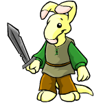
Okay, okay. I know you didn't request the Cybunny (now recoloured and wielding a trendy carrot sword), but I was having serious trouble building an entire set around the carrot smiley. But, I do have to say, I absolutely adore this set - and despite all the hard work I put into the Cybunny, the avatar is definitely my favourite part
Oh, and sorry there aren't any cutouts. I did try it with cutouts, but it looked like it had been pieced together by my cat. So I decided to leave it as a nice rectangle type shape. Hope that's okay with you!
So that works out as... 5 sets in 1 afternoon. These 4 and one open request. All-in-all, I think I did good - especially considering I wasn't going to have anything posted until Monday. Yay me!
Anyway, forgive my pointless rambling after each of the sets. I'm sure that one day I'll get tired of it, and just post the set. But I'm new at this and it's all fun. HeHe.
*wanders off rubbing his temples while he searches for food*


