Kitten Medli


Ooo, pretty. Nice brushing in the background. The image, I think, isn't one that's easy to work with, so good job on cutting that out. Everything's pretty good, perhaps move Mario to the right a little bit, so there's a little less distance from the main text and Mario. Also, I dont quite how the subtext's outline sometimes changes to white. Perhaps the set would look better without the pixel text. -
8.5/10
hakojo


The way you've manipulated the image, gives off a very nice effect. There's a sort of simplistic elegance to it. Works very well with the manga style image you have chosen. Also, kudos on not using pixel text, the subtext looks great. One thing is, perhaps move the whole image to the left a little next time, so there's a little more room for the subtext and a little less on the right side. -
9/10
loser1921

The problem I have with this set, is mainly that the main image doesn't quite fit with the background. The colors dont exactly mesh together well. Also, the main text seems to thin and small for the space it's got. The 3-d doesn't quite add to the grungy effect that you were going for, perhaps another font, black and set on overlay, would work better for this set. Also, there's a lot of room, so I think the set would look better with a windows default font, rather than pixel font. (I find Georgia works quite nicely sometimes). -
7/10
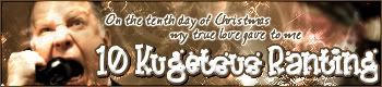
Kugetsu

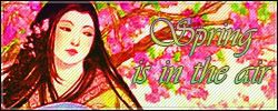
You have potential, Kuge.

Firstly, the green scanlines on the signature, actually detract from it. Especially when it's super visible on her face. I also quite like the colors, though. However, the biggest point docker is probably the main text. I think, it would have been better to keep it simple. You could use more than one font, for example, you can keep the font you used for spring, and make it bigger. Get rid of that black stroke, and perhaps have the fill of the text be a solid color. If the text isn't visible, do a black dropshadow, instead of a stroke. The subtext can be a whole 'nother font. Since it's only three words, use a windows default font. Georgia, Bookman Old Style, etc. -
6.5/10
DM was on fire!


Actually, I quite liked the original image's colors. I think it would've looked good if you kept her hair blonde, and such. In future sets, perhaps try matching the background to the image, instead of vice-versa. Also, the problem with such a long username is that, the sig will have to be long to compromise for it.
Try playing around with text placements, not having it all on one line. -
8/10
Ansile

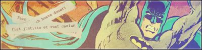
I love the subdued effects. The graphic is very pleasing to the eye. I love how you did the text, though I wish the paper strips took up a little bit more room. The faded JUSTICE looks a little weird on the avatar, but you cant see it that much.
-
9/10
LAQ


I really like how you repeated the image, to make a background.

The main text is very, very pretty. And I really like the gradient on it. I dont quite like the font for the subtext, however. -
9/10
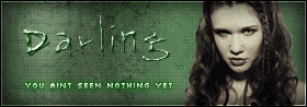
YesItIsh


In a way, this isn't really your fault. The image you chose was already super contrasted, so the end result had to be somewhat like that. But next time, perhaps pick an image that is easier to work with. Something not very contrasted, so you can control how much is in the final result. I like the text though, it adds to the signature nicely. For the avatar, I think the border is too thick, and since you only have a one pixel border on your signature, they should at least, somewhat match. You dont need an 80x80 avatar, sometimes a rectangular avatar looks quite good. -
7.5/10
Ken


The set is simplistic, which isn't all bad. But, I really dislike the cutout on the item. I know it's really hard, to cut out an image like that, but perhaps a small white dropshadow would help cover some of the greyish color up. I know, however, that there are items with thicker outlines on subeta.
The pixel subtext works here, though.
-
8/10
Zilary


This set also has a simplistic charm to it. I cant quite pinpoint on what, but the main text looks a little awkward to me. I do like the subtext, however. Also, the border doesn't quite fit this signature. A simple one pixel border might've actually worked better. Try experimenting with the backgrounds, if you have photoshop 7, try starting with a cloud render, and go from there. You can also use other images for your background, brushes, etc. -
7/10
jade_em


I actually quite liked the colors in the original image, so I kind of wish you didn't color hue the image blue. Also, for the main text, the text seems kind of suffocated by the stroke. PSP has an annoying habit to leave half the stroke inside, and half of it outside. If you leave it as a solid color with a dropshadow, that would look pretty good. Also, a more cursive font would surve the purpose of this set well. Lastly, you have saved the image in a JPEG, and the JPEG compression looks really bad. Next time, you should save your files as PNG, or, go to File, Export and then JPEG Optimizer. Set the compression to 1, and 1x1x1 to save as a perfect JPEG. -
6.5/10
Neko


Ahh, pretty. Though it is, I think you might have gone just a little bit overboard.
But the overall effect is nice. I kind of wish you left the signature scanline-less, like the avatar, as well. Or just erase the scanlines where her face is. I do like the text, though. -
8.5/10
Rachel

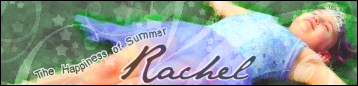
I think your set would look much, much better, without the brushes from Lushgirl.
I like the color manipulation on the girl, but you cant see her as well through the low-opacity brushes. Also, if you are going to brush though, use the brush just a little under the size they come default at. Just so it doesn't look jaggedy at the edges. I think the text would also look better, if you had set it on overlay or something. Because the black doesn't really match any other part of the signature. I like how the subtext is on a path, though.
-
8/10
jellyoflight


Abstract signatures are sometimes fun, but the whole set has a messiness feel to it. The white dots are quite distracting, and the sun bursts look jaggedy at the edges. I like the font you chose for the signature, but I wish it wasn't squished to the side like that. Since there isn't really a focus, the would be the only one. So it should be bigger, and perhaps have a nice blue dropshadow to it. -
6/10
Bangel


Firstly, I really, really, really like the text placement. The signature has a sort of nice feel to it. The colors work great together as well. The texture, doesn't quite seem to repeat perfectly. I'm not sure if it's on purpose or what, but sometimes it's quite distracting.
-
8.5/10


 - Set by Sapphire Faerie


