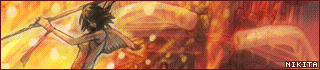
I understand the judges comments, especially about the mushroom and leaf dominating. I wanted the icons on my desktop to be visable, which is why I have a faded background, I tried it, so it was more visable, and felt the functionality was reduced by doing so. The reason the leaf is a rather bright red is because it is the MapleStory logo, a red maple leaf. Even if the mushroom is bold though, I like my work to have a focus. In this case, it was the mushroom and the leaf. My icons still fit perfectly on the side, yet, it also has a focal point. Maybe it was a little too bright and dominating, but thought I should include my reasoning.
Click the wonderful signature. You know you want to.
Insane Plushie - I'd say you have a good base for an icon, but it strikes me as way too mellow. The colors are quite alike all over, and even though one can clearly see details and what the image you used is portraying, text etc. it just seems as a blur of different tones of light blue and violet. You would have definitely needed to include something that stands out of the mass.
Pixa - I love the way you have managed to make this icon so warm and inviting, I could start rambling about cozy evenings at the fireplace in autumn, but I won't. The contrast between the darker area around the border and the rest of the icon is a bit too strong, you should have worked you way around that somehow. Maybe you could have included more, faded out leaves in the background too, having just one makes it look somewhat empty.
DM was on fire! - The simplicity in this icon disturbs me a bit, I'd rather see something out of the ordinary, for example a new image effect, imaginative borders etc. that would make me go "wow, that's really clever, I would not have thought of that!". Nevertheless, you have an artistic eye for matching simple things and not going overboard with things, so this icon is well-combined. Maybe you could have moved that guy a bit more to the right, I don't like how "diverse" is literally poking him in the eye.
Neko - Personally I think you have gone a bit too wild with the image effects on this icon. It strikes me as quite messy and I can't get a hold of the theme or feeling you were trying to achieve in this one. The black text on top looks really out of place.
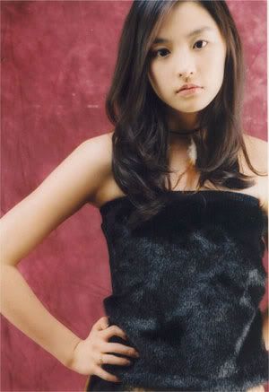
Nikita - Now we're talking LJicon. Your entry is the only one out of all seven that I would regard at as an LJicon instead of an avatar to a random forum, if I didn't know all of these were made as LJicons, I mean. Nice use of color overlays based on the woman's dress, maybe you could have put some more strength in the darker border area though (not much, just a bit).
WIS - Seeing that you chose a red theme for the background I believe you could have made the border a bit more towards that style as well, now it looks a bit too strong. Now that i think about it maybe it would have been a better idea to give it some color like the ones on the man's shirt, making the icon more open and not as boxed-in as with all the black (hopefully at least someone understood what I was going on about just there...). Other than that I think you've done a good job with the rest of the icon.
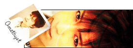
Amethyst - First of all I would have rather seen you use and anti-aliased brush for the border, instead of making it so choppy with no anti-alias at all. Disregarding the negative critique I think it was very imaginative of you to place the text as you have now and the color-overlay looks good, making the icon stick out of the gray mass.