Pink Poogle Toy Forum

The official community of Pink Poogle Toy. Bear with me while I tweak everything
It is currently Tue Sep 15, 2026 12:05 am

All times are UTC


Post new topic  This topic is locked, you cannot edit posts or make further replies.  [ 189 posts ]  Go to page Previous 15 6 7 8 913 Next
Author Message
 Post subject:
PostPosted: Sat Oct 21, 2006 3:01 pm 
Offline
PPT Student (335)
PPT Student
Rachel wrote:
the whole of the black and white bit on the right is the text area (because personally i dont like small text areas on blogs - but thats a personal preference). I thought that the text would show easily would be obvious so i didnt post a picture of it, but this is what it would look like http://img.photobucket.com/albums/v390/ ... ogtext.png

Ok.
but personally, i like clean text areas, where its not too stuff'd, so it doesnt grab my attention from reading instead of looking at the background
in your case, because both parts, the coloured and B&W are so interesting, i couldnt tell where the main focus was, and without knowing where the focus was, i couldnt tell where the text area was, i should have been more clear.
but thats just me, i just perfer cleaner text areas :)


DM was on fire! wrote:
Thanks blueZ. :D
I did try and do a lot to it, but it was hard since the picture was dark. I should've had a layer on screen, and then one on hard light.

you are welcome :)
its just that, you have set a really high standard for yourself, so i judged a bit extra hard on you, because your entry last week was soooooooo good, and comparing to this week, i didnt see as much effort, its still good though, but you have to keep it up ;)

_________________
Image
- w i s


Last edited by blueZ on Sat Oct 21, 2006 6:45 pm, edited 1 time in total.

Top
 
   
 Post subject:
PostPosted: Sat Oct 21, 2006 10:23 pm 
Offline
Beyond Godly (2514)
Beyond Godly
Pixa wrote:
:( I'm sorry. I was going to do my ratings yesterday (as I've been busy looking at colleges/doing coursework this week), but my internet went down and wouldn't go back... up. So now it is in the said state (up), but I'm going out soon. I'll try and get them all done, however, in a short bullet point list.


Urg, it's going and coming, and going again.
So I'll just post the scores because I want to contribute, I'll add comments when I can.

LAQ:
Quite warm. Scary cat. :( But cats are kinda cute. Heavenly feel to it!
Well worked. A good, sturdy effort.
8.5/10

Ansile:
Manipulated to give an antique feel. The ripped paper seems to work well for you. I like the stained, vintage look.
Text area is a big problem for me. Too transparent.
7/10

Zilary:
A very clever and creative blog. Original and different.
There are a lot of colours here, maybe reducing your selection could co-ordinate it better. Solid blog area.
7.5/10

Hakojo:
Lovely. This graphic has a very nice finish. I really feel what you're trying to convey here. Seamlessly blended. A very, very good graphic.
9.5/10

Kugetsu:
The blending is very good, it flows very well. The text is a huge improvement to the flat one that you used previously, this is much more lively. Keep looking for fonts though, this doesn't fit as well as some other choices out there. A creative effort. Cut out the mountains with slightly more care too, prehaps more finely.
8/10

Ken:
A very simple and clean effort. However, for your desired effect, this really works well. The scanlines add a simple elegance and really complete the graphic.
9/10

Rachel:
I had no problems distinguishing between blog and image. This is imaginative, a very creative look on the subject. I find the blurriness slightly distracting though, and that bothers me slightly. However, I praise your different angle.
8/10

DM was on fire!:
The parts where the girl in the picture clashes with text area really bother me, making it slightly bigger wouldn't have hurt (though I know it is your style for the compressed effect). The effects are quite nice, and bring the image alive. However, it was a blog task, and functionability must be considered.
7.5/10

Bangel:
This is a very good effort. The effect is well acheived, and without looking very closely, you appear to have pulled it off seamlessly. It's very clever, I think you've managed to execute the desired effect very well. Prehaps making the text box slightly bigger veritcally, where there is space, would have been nice.
9/10

Jade_Em:
Hmm. This is a good, I like the way you've added colour and life to this image. However, it seems slightly blurred and dull. It's okay, but nothing spectacular.
6.5/10

Neko:
The graphic is really good, the blog area is huge, and that's all very good, except the anti-aliased 'subtext' really bothers me. Changing it would have made me happier, however, it's still pretty fantastic as it is.
9/10

Medli:
I wish you'd chosen to put the fox on the left and the text area on his right. The hammer, as it is, would be covered by the scrollbar, and it would make it look slightly fragmented. The background is slightly boring, but it very well extracted, and I like the style here.
8.5/10

Yay, doneness.

_________________
Image
Click the wonderful signature. You know you want to.


Top
 
   
 Post subject:
PostPosted: Sun Oct 22, 2006 12:45 am 
Offline
Way Beyond Godly (5797)
Way Beyond Godly
Tom wrote:
Cut out the mountains with slightly more care too, prehaps more finely.


Well, I blurred the mountains after I cut them out (because I didn't think they would look realistic if you could see the edges of them perfectly). Perhaps I misinterpreted what you meant by "fine", though.

_________________
Image
CLICK IT!
Thanks to Laq. :o


Top
 
   
 Post subject:
PostPosted: Sun Oct 22, 2006 1:06 am 
Offline
Beyond Godly (2514)
Beyond Godly
Kugetsu wrote:
Tom wrote:
Cut out the mountains with slightly more care too, prehaps more finely.


Well, I blurred the mountains after I cut them out (because I didn't think they would look realistic if you could see the edges of them perfectly). Perhaps I misinterpreted what you meant by "fine", though.


:P I meant that I'd thought you used a layer mask and used and airbrush paintbrush type thing, to make the edges blurry. =p Perhaps less blur next time.

*looks innocent*

_________________
Image
Click the wonderful signature. You know you want to.


Top
 
   
 Post subject:
PostPosted: Sun Oct 22, 2006 6:02 am 
Offline
PPT God (1117)
PPT God
Week 2

LAQ
Image

Balance: The balance is great on this one, it's very soothing in a kind of retro way.
Colors: I like the adjustments you made to the original image, it makes it much more warm.
Text Area/Text: The text area is very well placed, however I do have some concerns with what color text would be used, because with an image like this the only colors that would be visibale and work fairly are dark colors. The font you used for the mian text is great.
Look: Very dream-like. I like it.
Blog Score: 9
Overall: 8


Ansile
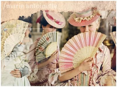
Image

Balance:I have a love hate relationship with the balance of this image.
Colors: I love the pastel look and feel of this image because it really works well with the era in which Marie lived in.
Text Area/Text: This is what I have a problem with, I understand the reasoning behing the small text box, but again as stated before, the color options for the text are very limited. I like the litte '/marie antoinette' at the top, it shows that you understand the concept of the picture and the movie's concept.
Look: I like it. Had it not been fore the text box, it would've been flawless.
Blog Score: 8
Overall: 9.5


Zilary
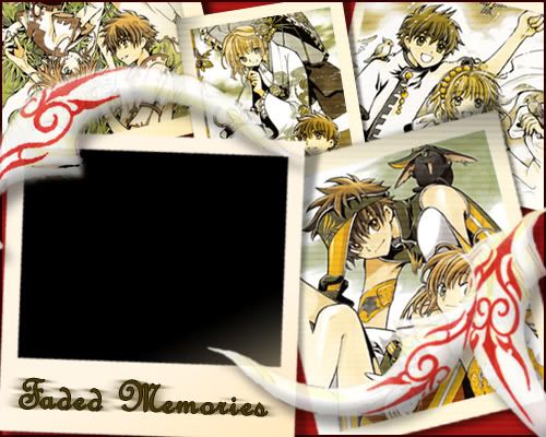
Image

Balance: The balance is grea,t however, the 'feathers; are a bit of a distraction.
Colors: The colors all work very well.
Text Area/Text: I really don't like the text area in this one, it looks more like it could be used for a slideshow type thing/feature.
Look: It works well.
Blog Score: 6
Overall: 8.5


hakojo
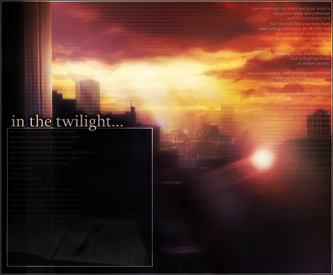
Image

Balance: The balance between the two images is on the verge of crossing the line of being awkward. But still good.
Colors: Very eerie, loves it!
Text Area/Text: The text area is well thought out, I like where you positioned it.
Look:Post-Apocalyptic, ver nice.
Blog Score: 8
Overall: 8.5


Kugetsu
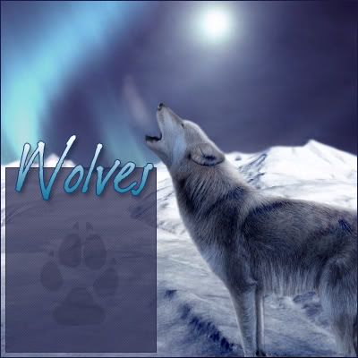
Image

Balance:Very nice.
Colors: It all works very well.
Text Area/Text: Very well positioned, love the paw print, the font color wouldn't be as much of a problem in some others.
Look: Wow. Just wow. You win the internetz. However, a different font would've made it even better.
Blog Score: 9
Overall: 9.5


Ken
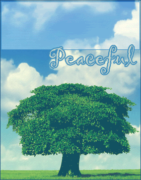
Image

Balance: The balance is good in this one.
Colors: The colors are very summer-y and uplifting and fun XD
Text Area/Text: I like how you positioned it, it's very smart.
Look: Simplistic. I love it. The scanlines actually help in this one.
Blog Score: 8
Overall: 8


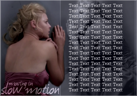
Rachel
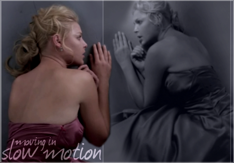
Image

Balance: Well, the balance is alright in this one, but it isn't up to par really.
Colors: The colors work well, it works well with the look and feel of the image and what Izzy was going through at that moment.
Text Area/Text: What bugs me is the look the second image gives it, it sort of looks reflected. I mean I understand it, but it's sort of cliche, I think, in this case, a close up of her, or maybe a different image of her would've worked better. Again the text color could be a problem.
Look: Very sad and grey. I like it.
Blog Score: 5
Overall: 7


DM was on fire!
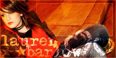
Image

Balance: The balance is great on this one.
Colors: The colors all work well, I really appreciate how you kept the original colors of the image, it shows that you're really listening to the jcomments we all make.
Text Area/Text: The text area is great, but again, it concerns me that the font color for the blogger might be dificult to choose.
Look: It has a very urban look to it.
Blog Score: 7
Overall: 8


Bangel
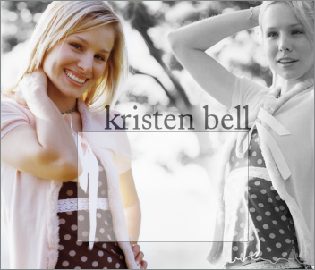
Image

Balance:The balance on this blog is very well thought out, it work great with the original.
Colors: The colors work very well.
Text Area/Text: The text area on this blog is awesomely placed.
Look: I like the blend, but I can see the parts where you tried to make it transparent. Mainly the whole right side of her face/hair.
Blog Score: 8
Overall: 6


jade_em
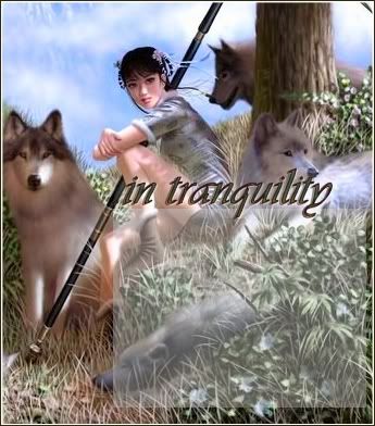
Image

Balance: The balance is alright, however, I feel the text box looks a bit overpowering.
Colors: The colros are very 'woodsy' and natural.
Text Area/Text: Again, the text color could be a problem in this one.
Look: The look is very relaxed and natural.
Blog Score: 7
Overall: 8


Neko
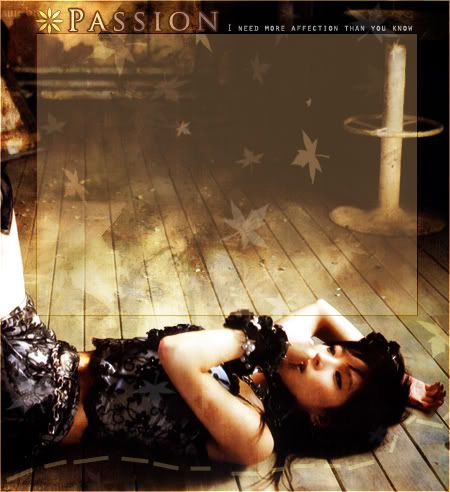
Image

Balance: The balance is outstanding on this one, it all works very well.
Colors: The colors are very warm, and I like that.
Text Area/Text: Again, as said many times before, the text area is flawlessly chosen, but my main concern is the font color that would be used.
Look: Very Autumn-y, I like it. Peaceful-chic.
Blog Score: 7
Overall: 9


Kitten Medli
Image

Balance: It's great, I love it.
Colors: The colors all work well.
Text Area/Text: The text area is centered so it makes it the main focus of the the image.
Look: I looks very sunshine-y :D
Blog Score: 8
Overall: 9

(Sorry it's so late! Will I be punished? :P)

_________________
President of the Sugarinii/Tasha fan club.
Sugarinii's soulmate... since 1991!


Top
 
   
 Post subject:
PostPosted: Sun Oct 22, 2006 8:00 am 
Offline
Beyond Godly (4874)
Beyond Godly
The results:
http://pptga.awardspace.com/

Unfortunatly, jade_em and Rachel are eliminated. :(


--


Week 3 Assignments:

S: N/A
A: LJ Icon:
- Create an LJ Icon
- The size is 100x100
- You must use a real life image (i.e. no Anime, paintings, etc.)

B: N/A
C: N/A

Maximum of 3 people may be eliminated this round.

All graphics are due by October 17th.


---


Graphic Notes:

- An example of some LJ icons are:

Image Image
(LJ Icons by memoryBlade)

Image

- LJ icons dont always need borders


Top
 
   
 Post subject:
PostPosted: Sun Oct 22, 2006 10:19 am 
Offline
Beyond Godly (2514)
Beyond Godly
Are you going to raise any boundries Mr. WIS? I think nearly everyone will break the S rank next round.

_________________
Image
Click the wonderful signature. You know you want to.


Top
 
   
 Post subject:
PostPosted: Sun Oct 22, 2006 1:43 pm 
Offline
Honorary Member (698)
Honorary Member
WIS wrote:
All graphics are due by October 17th


Uhh...October 17th already passed? I hope you mean October 27th...

So this time we're working with like, photos? Right? :D

_________________
Image


Top
 
   
 Post subject:
PostPosted: Sun Oct 22, 2006 5:45 pm 
Offline
Beyond Godly (4874)
Beyond Godly
Pixa wrote:
Are you going to raise any boundries Mr. WIS? I think nearly everyone will break the S rank next round.


Yes, but it'll be the round they're in after they complete the task. :P I just want to start off with a bunch of different tasks before I seperate the groups and do repeats. :)

And yes, Zilary, it is the 27th. :P And yup, photos.


Top
 
   
 Post subject:
PostPosted: Sun Oct 22, 2006 5:54 pm 
Offline
Way Beyond Godly (8715)
Way Beyond Godly
OOH. OOH. I KNOW WHAT TO MAKE. <3
Can it be like music videos or photoshoots, or does it have to be like actual photography?

_________________
Image


Top
 
   
 Post subject:
PostPosted: Sun Oct 22, 2006 6:20 pm 
Offline
Beyond Godly (4874)
Beyond Godly
DM was on fire! wrote:
OOH. OOH. I KNOW WHAT TO MAKE. <3
Can it be like music videos or photoshoots, or does it have to be like actual photography?


Anything involving something real-life. :) You're not limited to people either.


Top
 
   
 Post subject:
PostPosted: Sun Oct 22, 2006 6:20 pm 
Offline
PPT Student (278)
PPT Student
Image

Images: Here, here, and here.
Program used: Photoshop Elements

_________________
Image
So pay the price and close your eyes and play the game then I'll make you cry...


Top
 
   
 Post subject:
PostPosted: Sun Oct 22, 2006 6:31 pm 
Offline
Way Beyond Godly (8715)
Way Beyond Godly
ZOMG YESSSS
I'll be off making something. SEE YA.

_________________
Image


Top
 
   
 Post subject:
PostPosted: Tue Oct 24, 2006 6:30 am 
Offline
Way Beyond Godly (6691)
Way Beyond Godly
User avatar
Image

Programs: Paint and Photoshop Elements
Original Image: http://img.photobucket.com/albums/v37/Medli/pic3.jpg

I love you, mom. [/cheese]

BTW, did nobody notice beside the line of stars on my blog, the little shiny thing that was way too close? And how bad it made it look?! XD

_________________
Image


Top
 
   
 Post subject:
PostPosted: Tue Oct 24, 2006 7:30 am 
Offline
PPT God (1519)
PPT God
Here is my feeble attempt. >.<

Image

Program : Photoshop CS2
Original Image : Click!

Its a big picture.

PS - Jessica Alba is hot.

_________________
Image - Set by Sapphire Faerie


Top
 
   
Display posts from previous:  Sort by  
Post new topic  This topic is locked, you cannot edit posts or make further replies.  [ 189 posts ]  Go to page Previous 15 6 7 8 913 Next

All times are UTC


You cannot post new topics in this forum
You cannot reply to topics in this forum
You cannot edit your posts in this forum
You cannot delete your posts in this forum
You cannot post attachments in this forum

Search for:
Jump to:  
Powered by phpBB® Forum Software © phpBB Limited