October wrote:It is a bit difficult for me to tell if there's an unread topic or not as the colors are quite close on my computer. I like it nevertheless though

Mm, the topic icons (rather than the board icons on forum index)? Sticky/announcements are probably the worst off, as the difference is mainly in the gray shading, which doesn't really fit to begin with. Am I describing the right icons?
Byakuya San wrote:Ha, my set looks terrible against that background (notably, you can't see the text XP).
Mm, black on dark green can do that. You could probably add a single-pixel dark gray border around individual letters?
Zilary wrote:Is there going to be a Christmas style too?
I really have no plans in regards to that. Come to think of it, I really didn't have plans in regards to this, either. Perhaps there will, perhaps there won't.

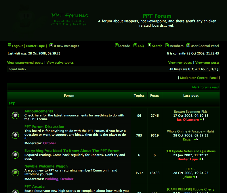
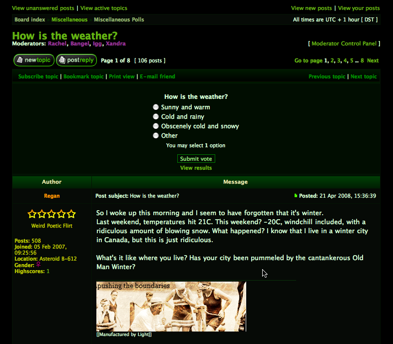
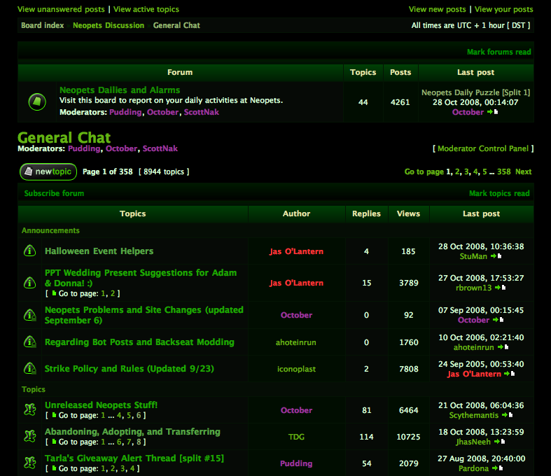






 It is a bit difficult for me to tell if there's an unread topic or not as the colors are quite close on my computer. I like it nevertheless though