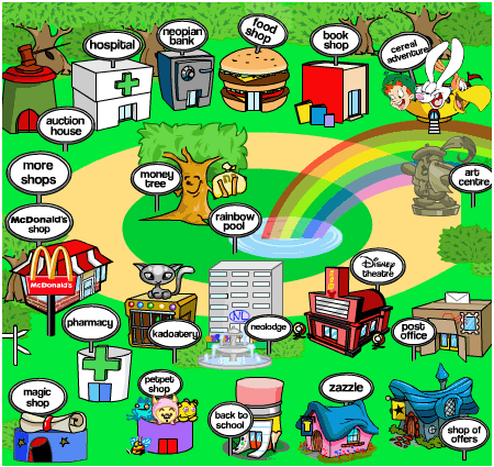
I can almost bet a left sidebar ads are coming. Because I just noticed that the main shop map seems moved or smaller and there is a lot of white around on the left side. And also I checked an I think the images have been updated today to make them a hair smaller so that they can start making left side ads.
Anyway, all I have to say is NEVER NEVER NEVER click on an ad on neopets. No matter where it is, no matter how flashy or pretty it is, NEVER click it. I don't, because I feel it just encourages them to make more. I mean, first we have little ads, then they get bigger..and BIGGER..and FLASHIER..AND NOISEIER..take a hint..no matter how many you make..I AM NOT CLICKING!!!
You really should change your name to key hole pets..because neopia is getting smaller every day!!!
Key hole pets...
Moderator: Moderators
-
smudgeoffudge
- PPT God

- Posts: 2282
- Joined: Sun Jun 06, 2004 5:09 pm
- Location: Yurble Land

-
DiscordantNote
- Honorary Member

- Posts: 3386
- Joined: Mon May 31, 2004 4:59 pm
- Location: Lookin' through a glass onion

-
smudgeoffudge
- PPT God
- Posts: 2282
- Joined: Sun Jun 06, 2004 5:09 pm
- Location: Yurble Land
-
AFI_Sorrow
- Beyond Godly
- Posts: 4116
- Joined: Wed Jun 30, 2004 6:13 pm
- Location: New Jersey. The state we love to hate and hate to love.
*trembles* Smudge, your right! Geez, if that's so I may just think about packing up my bags in the Neopian world. I'm hardly on Neopets anymore, just checking in daily to do a quck lab zap and see what's going on...but...rgggh!
And if you real close, the "ad sized space" is a brighter shade of white than the background...definetley reserved for something.

And if you real close, the "ad sized space" is a brighter shade of white than the background...definetley reserved for something.



Yeah, if they add those, I'm just Ad-Blocking them. I seriously couldn't play the site if I didn't use Firefox. Whenever I go onto my second account using IE, I get tons of Active-X warnings, slow-loading pages, and some pages that won't even load because of the bottom ads.
There are already four things being ad-blocked on almost every page I visit (top banners, bottom ads, side button ads, and something else -- another part of an existing ad, I guess), and I can't believe they might add MORE.
There are already four things being ad-blocked on almost every page I visit (top banners, bottom ads, side button ads, and something else -- another part of an existing ad, I guess), and I can't believe they might add MORE.
-
smudgeoffudge
- PPT God
- Posts: 2282
- Joined: Sun Jun 06, 2004 5:09 pm
- Location: Yurble Land
-
AFI_Sorrow
- Beyond Godly
- Posts: 4116
- Joined: Wed Jun 30, 2004 6:13 pm
- Location: New Jersey. The state we love to hate and hate to love.

-
smudgeoffudge
- PPT God
- Posts: 2282
- Joined: Sun Jun 06, 2004 5:09 pm
- Location: Yurble Land
-
metalmario
- PPT God
- Posts: 1378
- Joined: Mon Jun 28, 2004 11:31 am
- Location: Texas
Re: Key hole pets...
smudgeoffudge wrote:Anyway, all I have to say is NEVER NEVER NEVER click on an ad on neopets. No matter where it is, no matter how flashy or pretty it is, NEVER click it. I don't, because I feel it just encourages them to make more. I mean, first we have little ads, then they get bigger..and BIGGER..and FLASHIER..AND NOISEIER..take a hint..no matter how many you make..I AM NOT CLICKING!!!
This isn't really necessary, the point of the ads are NOT to irritate the players (no matter how much it seems so
 ) They are to fund the site. I've seen this same reaction to a message board I used to frequent, they had *gasp* one banner ad at the top of the page. Nobody bothered to click it, and the webmaster ended up not being able to afford the site, so we had to switch to an EZboard. That really, really sucked. Now we had a good 5 banner ads per page, plus popups. We eventually moved back to the old site, but we learned our lesson. I click at least once a week now
  [/anecdote] Not clicking will not just "encourage" them to get rid of them, they will just add more, under the logic that "x number of ads isn't enough, more will increase the chance of someone clicking something they find interesting."
ANYWAY. I still don't see a difference between the two maps. o.o?
smudgeoffudge wrote:Well maybe it isn't the actual map that was made smaller. But something was made smaller or something was moved. Because there is now a good sized chunk of white area off to the side where there wasn't one before. And it seems just to be the perfect size to put a side banner...
Perhaps they added a <center> code? Thats what it looks like to me...
-
Morningstar
- Beyond Godly
- Posts: 2834
- Joined: Mon May 31, 2004 4:32 pm
- Location: Far, far away
Cranberry wrote:Yeah, if they add those, I'm just Ad-Blocking them. I seriously couldn't play the site if I didn't use Firefox. Whenever I go onto my second account using IE, I get tons of Active-X warnings, slow-loading pages, and some pages that won't even load because of the bottom ads.
I totally agree, Cranberry. Firefox is the only thing I use anymore. IE is so slow-loading that I can't be bothered with it. And, really, if I was stuck with only IE I probably would have quite playing Neo a while ago. Because it is next to impossible to restock or shop wiz hunt with IE. Firefox is my new best friend.


Tested made this fabulous set for me!!! Isn't it great?